RYT: BUILDING AN OPPORTUNITY ECOSYSTEM
RYT: BUILDING AN OPPORTUNITY ECOSYSTEM
Business challenge: Win credibility as a new Layer 1 blockchain in a crowded category, with a business model that depends on governments and financial institutions trusting a technology most of them see as risky.
Brand challenge: Build one identity that works for four audiences who want completely different things: crypto investors, developers, government and institutional buyers, and everyday people in underbanked markets who may never know they're using a blockchain.
Solution: A brand platform built around opportunity instead of technology, "The Opportunity Ecosystem," expressed through a visual identity that grounds digital infrastructure in the natural world. Each audience gets its own world, and the system holds them together.
Results: A complete brand built from nothing: strategy, messaging architecture and a 131-page identity system (V1.0 October 2025, V2.0 February 2026), rolled out across the website, products, social, investor and partner decks, video and a RYT-hosted event at Token2049 in Singapore, attended by Panama's Ambassador to Singapore.
When I came into RYT, the company had strong technology and a real story: a Layer 1 blockchain that is architecturally gas-free, built for sovereign-scale deployment, and building for national governments on identity and payments, starting with Pakistan. What it didn't have was a brand. There was an AI-generated logo and a shade of blue. No messaging, no positioning, no brand strategy. Nothing that could carry the story to the people who needed to hear it.
Blockchain is a hard category to stand out in. Nearly every project shares the same visual vocabulary: dark backgrounds, neon gradients, abstract geometry and a lot of promises about the future. RYT had an extra problem. Its buyers are central banks, regulators and ministries, and its end users are a grandmother in Karachi saving through a committee. Neither of those people is moved by neon.
The category also forces a false choice. Permissioned networks gatekeep who gets to participate, and public chains can't meet institutional needs on fees, security and compliance. RYT's whole reason for existing is that it doesn't make you choose, so the brand couldn't pick a side either.
Four audiences, one platform
We started with strategy, not visuals. I wrote the brand architecture: vision, mission, purpose, five brand values, positioning, and a messaging matrix that mapped each audience's need, emotional driver, barrier and reasons to believe. That became the creative brief. I ran the agency search and selected A Friend of Mine, an independent studio in Australia, then briefed and managed them through two versions of the system.
The audiences really were that different:
Crypto investors need upside backed by real utility. Their barrier is distrust.
Builders need a market opportunity they can reach with familiar tools. Their barrier is fatigue.
Institutions and governments need rails that meet compliance, performance and security requirements. Their barrier is risk.
End users need a safe, reliable way to save, spend and earn. Their barrier is fear.
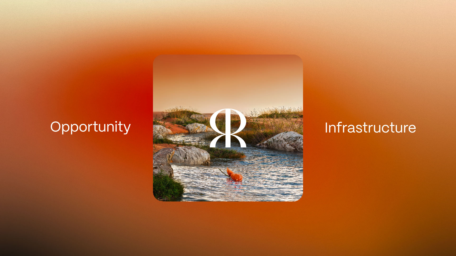
The common thread across all four was opportunity. RYT exists to put opportunity in reach for people who don't currently have it. The insight underneath was simple: RYT is where real economies go onchain. That gave us the platform, "The Opportunity Ecosystem," the working tagline, "Opportunity Infrastructure," and a single thought every message had to ladder back to: democratizing access to opportunity through sovereign, gas-free infrastructure. It also gave us a filter for every piece of content: does this help someone see an opportunity they didn't see before?
Grounding the digital in the real
The visual identity takes the opposite approach to the rest of the category. Where most chains lean minimal and synthetic, RYT pairs digital infrastructure with the natural world. The goal was for every touchpoint to leave people thinking three things: this is legitimate, this is for me, and this is interesting.
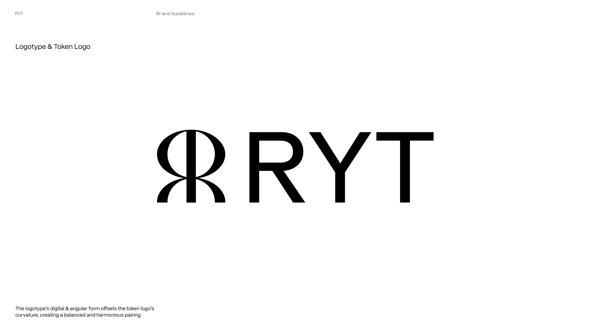
The token logo is two R's set back to back, revolved into a globe. It reads as connection and a decentralized network, and also as a person. The logotype, set in Repro, has sharp angular cuts that hint at a digital slash and balance the curves of the mark. The palette is three gradients drawn from nature (earth, growth and sky) with burnt red and bright lime as accents. A clean sans serif carries the voice, and a dotted monospace adds a digital edge.
An ecosystem for every audience
The idea I'm proudest of is the 3D art direction. Each audience gets its own natural world, and each world is tied to one of the brand's content pillars:
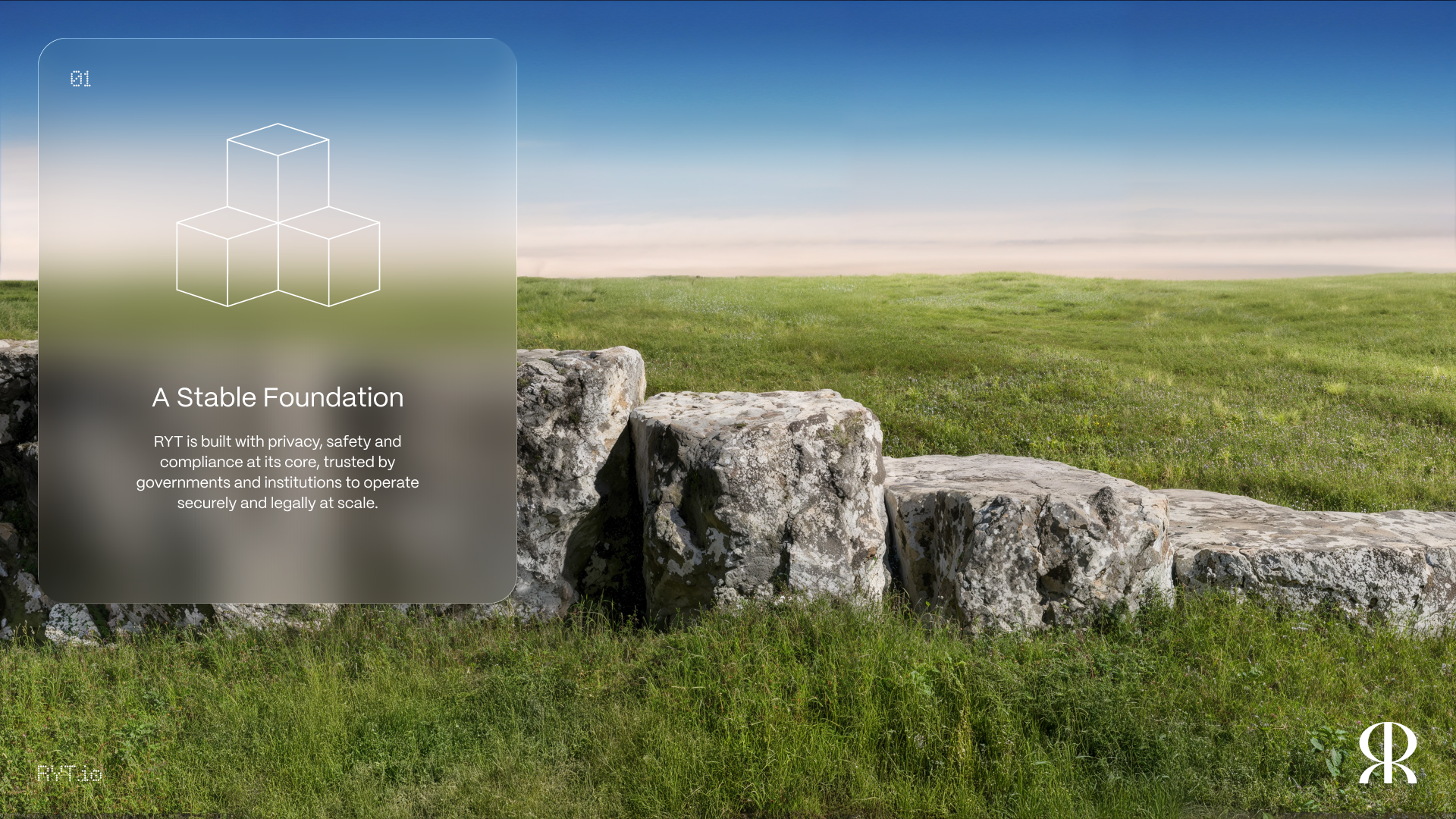
A Stable Foundation for Institutions: stone and earth for security and permanence.
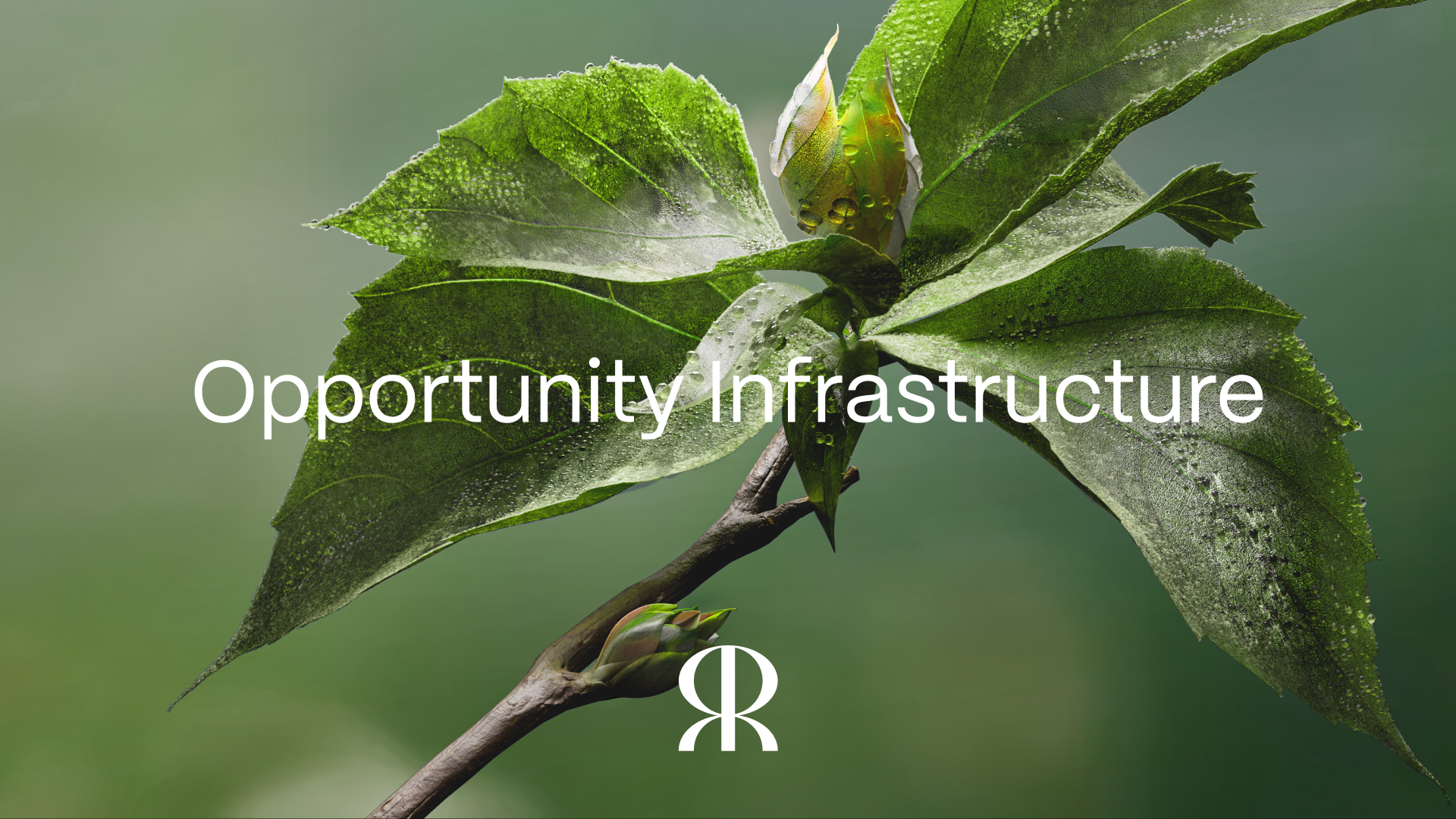
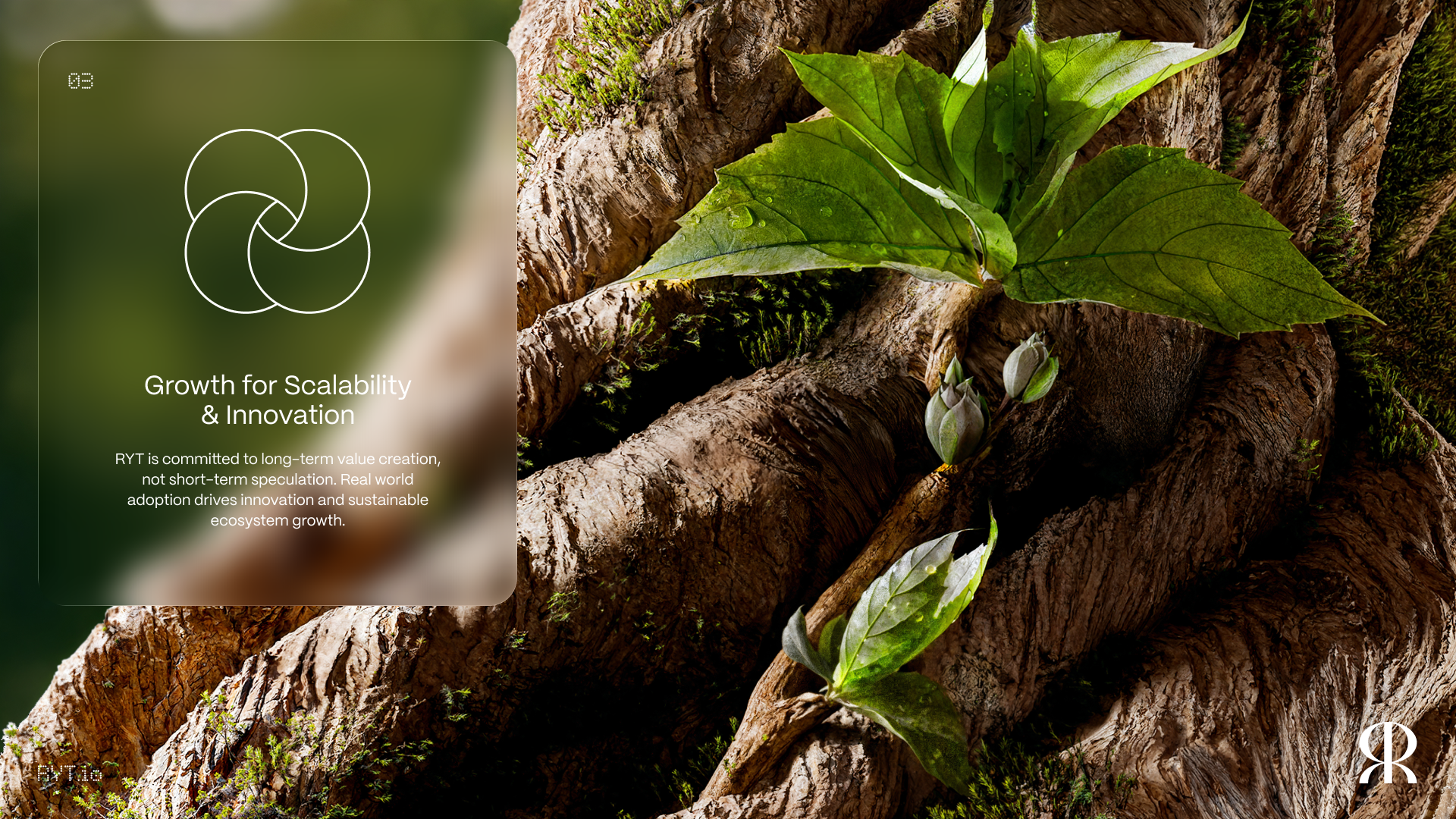
Growth for Scalability & Innovation: a living tree for investors, constant upward growth.
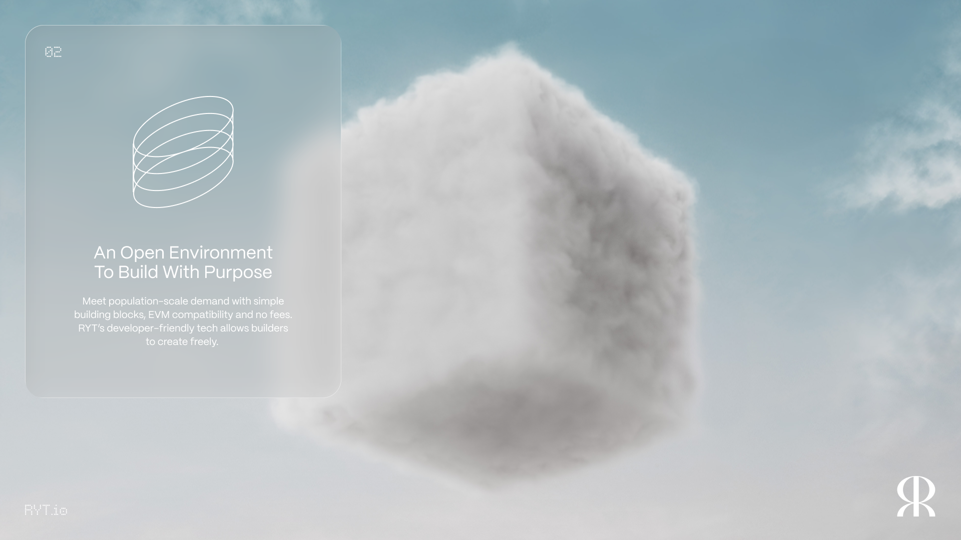
An Open Environment to Build with Purpose: sky and cloud for builders, freedom and possibility.
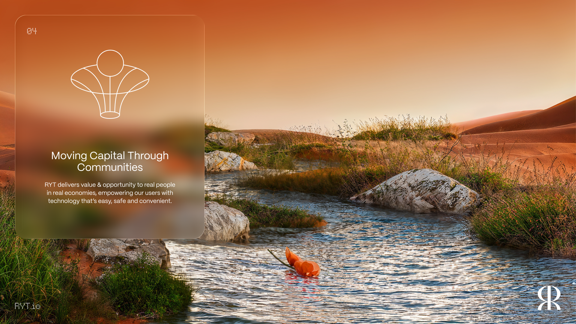
Moving Capital Through Communities: water for end users, value that flows to where people are.
Frosted glass panels and type sit on top of the renders, so the viewer feels like they're looking into these worlds rather than at a flat graphic. It gave us one system that could look serious enough for a ministry deck and still stop a scroll on X.
Rolling it out
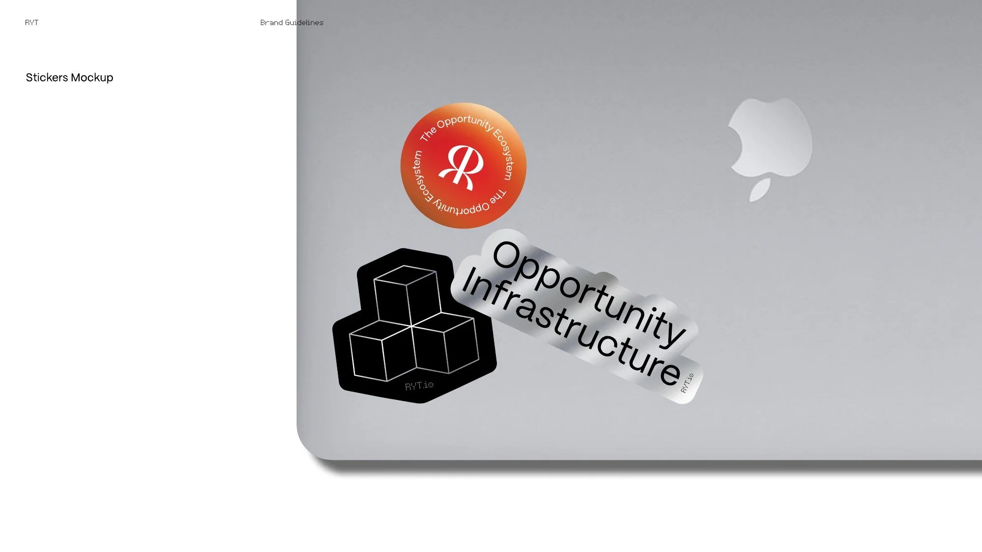
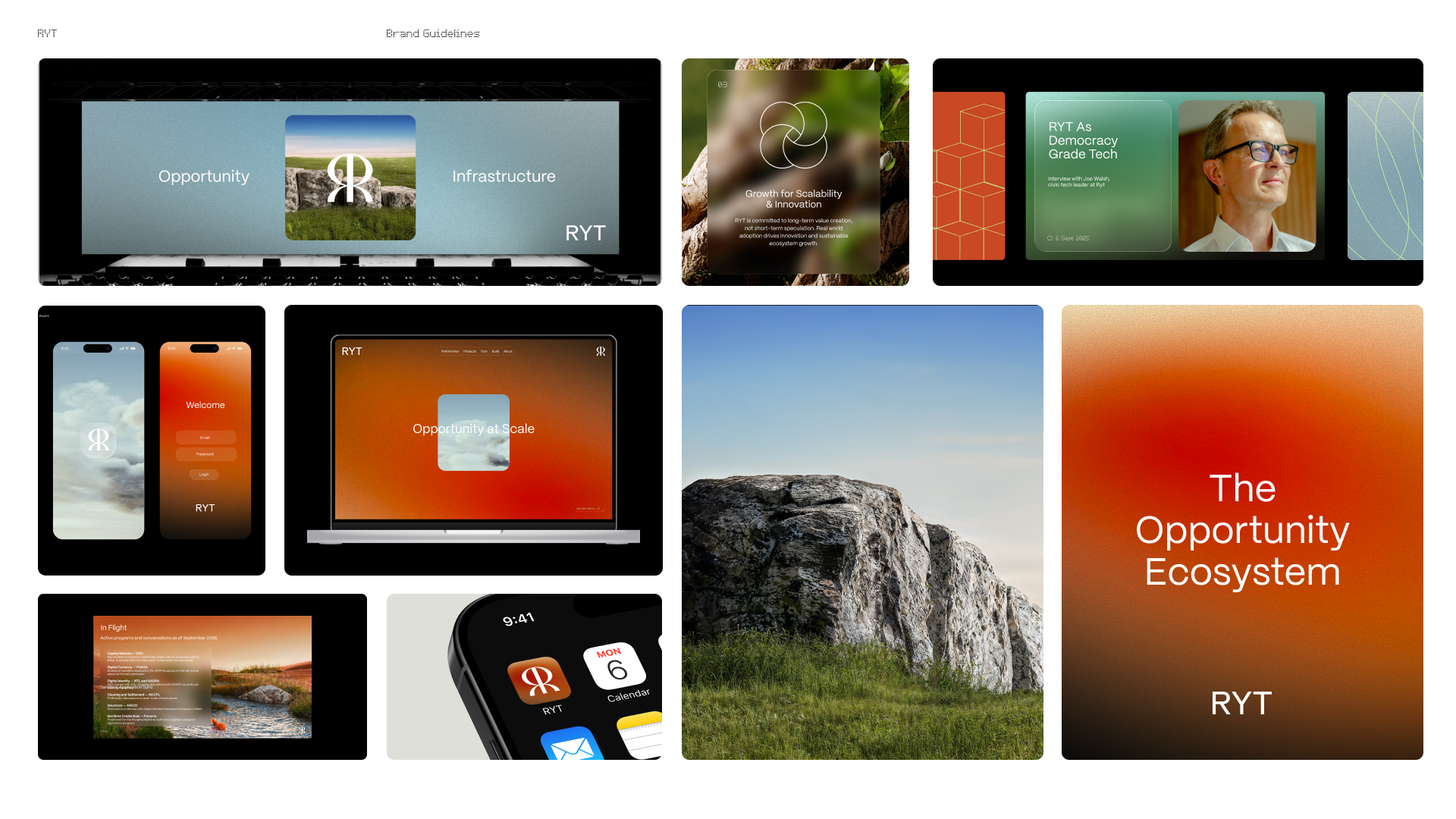
A brand book is only worth something once it's used. We applied the system to the website, products, social templates, presentation templates, a video intro and outro, event collateral and branded layouts for conferences like Token2049.
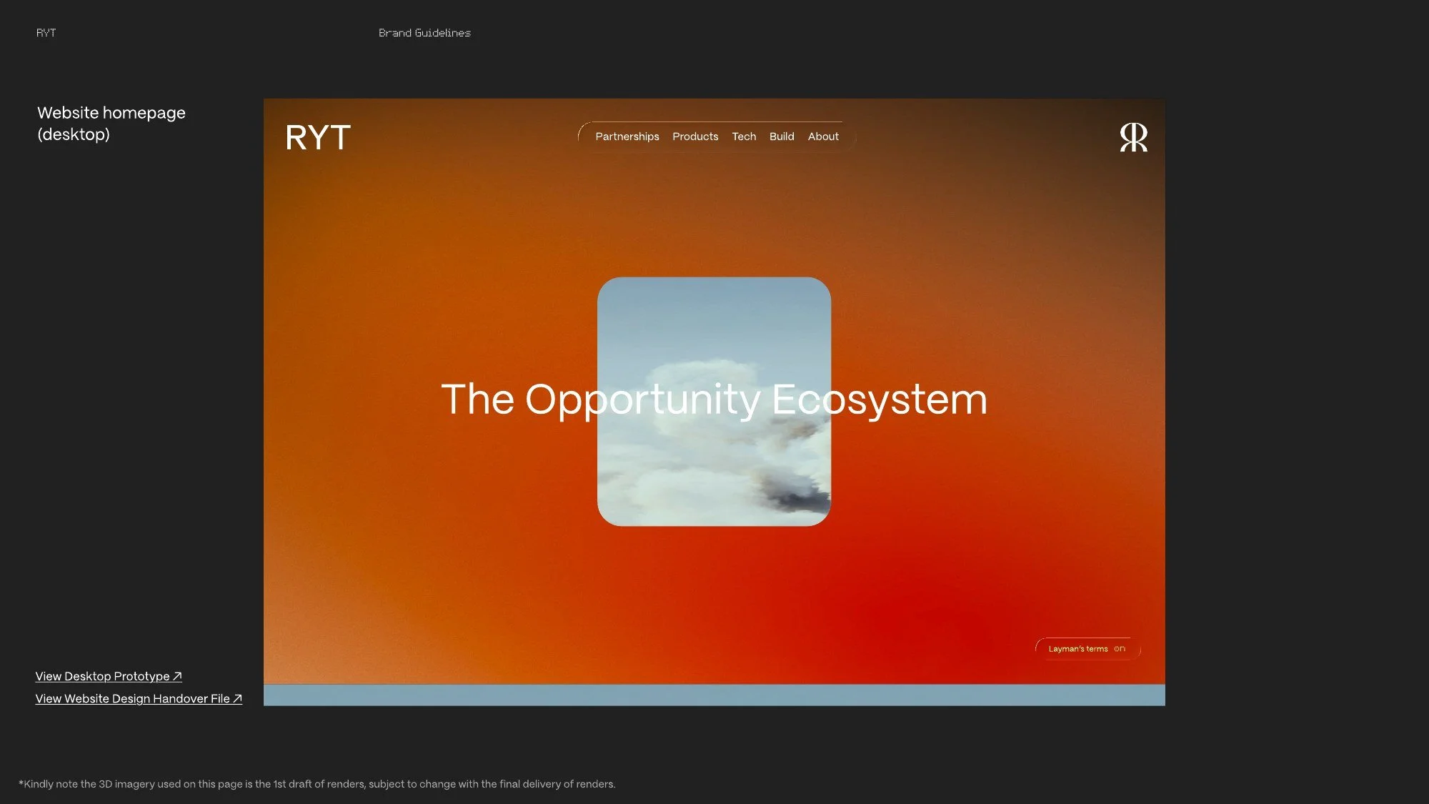
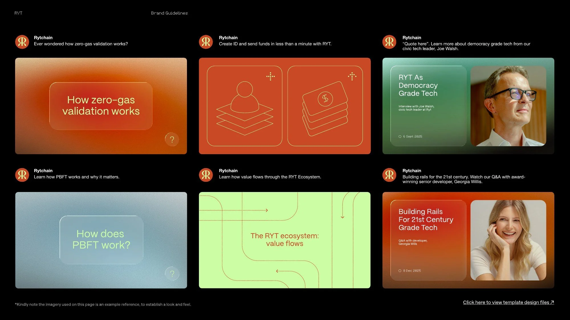
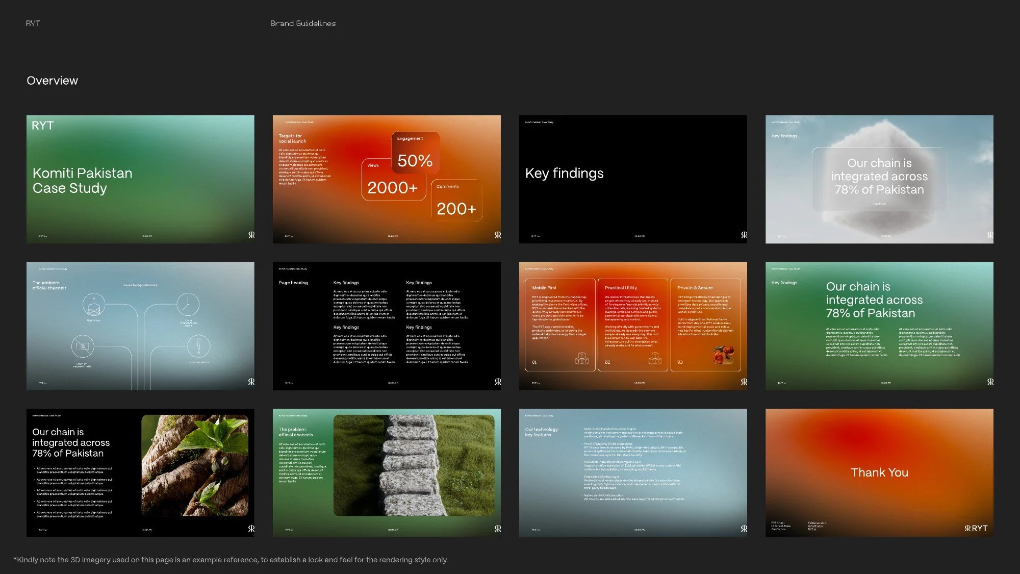
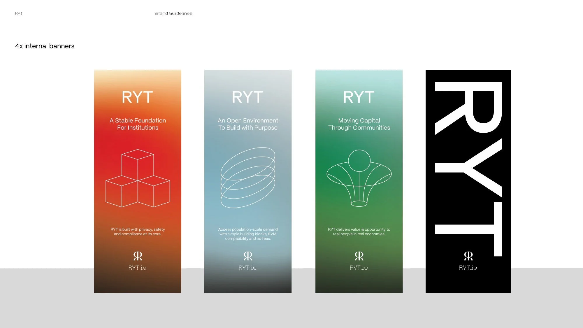
The biggest public test was our own event at Token2049 in Singapore, where the full system ran across the stage, screens, banners and printed collateral. Panama's Ambassador to Singapore attended, which says a lot about who the brand was built to reach.
The voice needed the same discipline. I wrote the X content style guide around one test: would a central bank governor find this credible? The voice we landed on was "a McKinsey consultant who understands crypto." That means specific numbers instead of hype, outcomes instead of slogans, and compliance positioned as a competitive advantage. A boilerplate copydeck kept every team and partner telling the same story.
To keep production fast with a small team, I also built a set of in-house tools with Claude Code, including a branded short-form video generator and a local transcription tool for voiceover sync. That let us turn out on-brand video without a production agency.